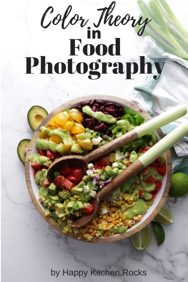
Whether you're a food blogger, or aspiring food photographer, one of the most important lessons you can learn is using color theory for food photography. In this article you will learn exactly how you can use color to make your images stand out from the rest.
You've created a masterpiece, it's beautiful, it's mouthwatering, and you're ready to capture this dish in all of it's glory, but you're wondering what is the best background color you should use?
What colors make your food more appetizing? Or maybe you're just not sure which element to include in your setup. Using color theory in your food photography is the deciding factor on whether your dish will pop, or flop.
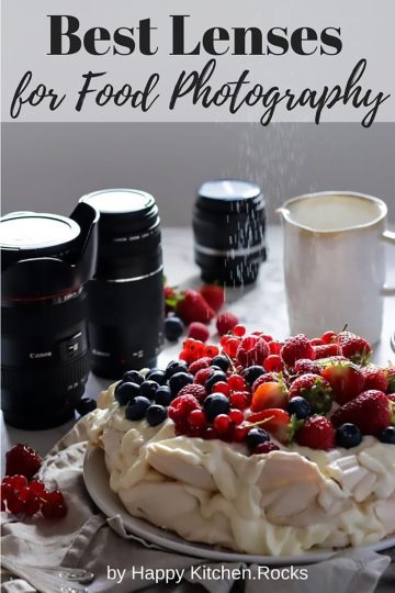
It's important to use the right food photography gear to make sure your colors look as bold and clean as possible. A good place to start is this article on best lenses for food photography.
How Do You Decide What Colors To Use When Photographing Food?
One of the first problems you will encounter when shooting food is how do you decide what color your props or your background should be?
Here are a few simple tips that are going to help you create an amazing photo:
1. Start by choosing your main color
Build off your main color and go from there. This is something you should already consider when you're developing a recipe since it can affect the choice of ingredients you'll include.
2. Color should be used to enhance your image
Choose a secondary color that makes your dish jump out of the screen. Too many colors, or a color that is not visually appealing will drown the image and cause distraction.
3. Choose colors that reflect your style and the type of the dish you are shooting
Imagine, you've just created a gorgeous, vibrant summer salad. Choosing light and bright colors will reflect the summery feeling. Darker colors, on the other hand are perfect if you want to create a cozy winter setup.
4. Don't use too many colors
This causes distraction. Color theory gives you a set of guidelines on how to combine colors in your photographs and create visual appeal.
Cool and Warm Colors
Cool and warm colors determine the mood of the image.
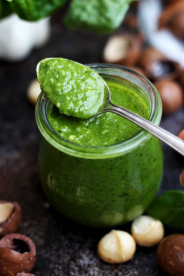
Cool colors like blue, green, magenta (add more) have calming and refreshing effect.
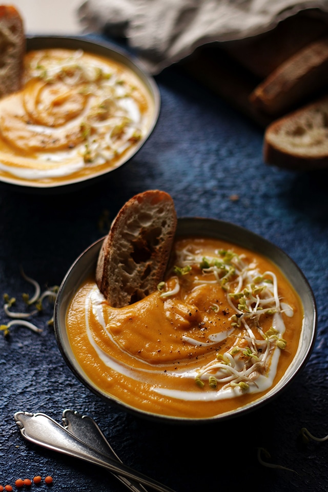
Warm colors like yellow, orange, red (add more) create a warm and positive feel.
By combining cool and warm colors in an image you create visual contrast that intensifies the coolness of cool colors and the warmness of warm colors creating visual interest and depth.
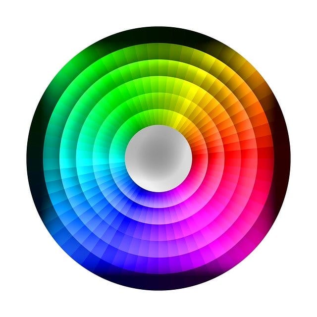
Using The Color Wheel In Food Photography
The color wheel is an amazing resource. You'll see on Adobe Color all the colors are organized by hues.
There are a few ways you can use this wheel to create color combinations that would work great with the food you are shooting and add up to a story that you are trying to tell with your food.
Saturated colors grab attention. But too many saturated hues might be overstimulating. Make sure you keep the balance between highly saturated and less saturated colors.
Depending on what hue and luminosity you're using, there are all types of hues and tints that you can use within the wheel to personalize your color choice.
First, you have to identify what your main color is going to be.
Then you can use some of the following options:
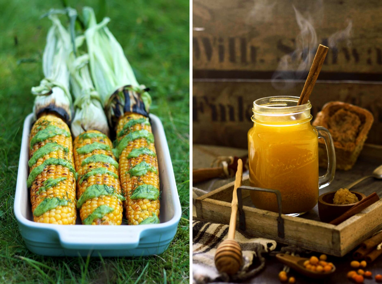
Analogous Colors
Locate 2-3 colors that are next to each other on the color wheel that include your main color. Using these colors will create images with a calm overall look and feel.
Examples are:
- green and blue;
- yellow and green;
- orange and yellow;
- purple and blue;
- yellow and brown, etc.
Complimentary Colors
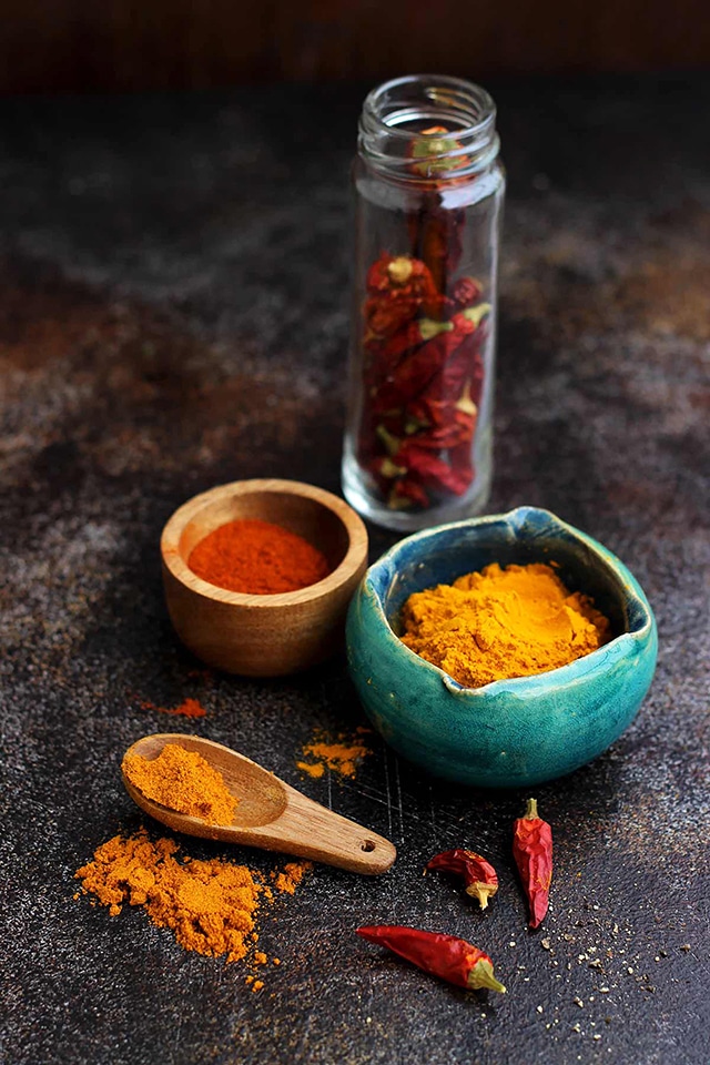
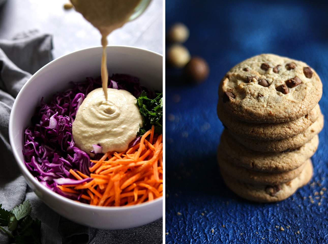
Complimentary colors are the opposite colors on the color wheel and using these together will make cool and warm pairings like orange hues with blue. This works wonderfully because it creates a visual contrast which is always interesting for the viewer to look at.
If you're shooting baked goods or potato dishes that are usually orangy or light brown, using complimentary colors is especially important. By adding cool grey or bluish backgrounds, you'll create a great setup to play on this contrast. Other color combinations would be red and green, purple and yellow.
Monochromatic Prop Setup
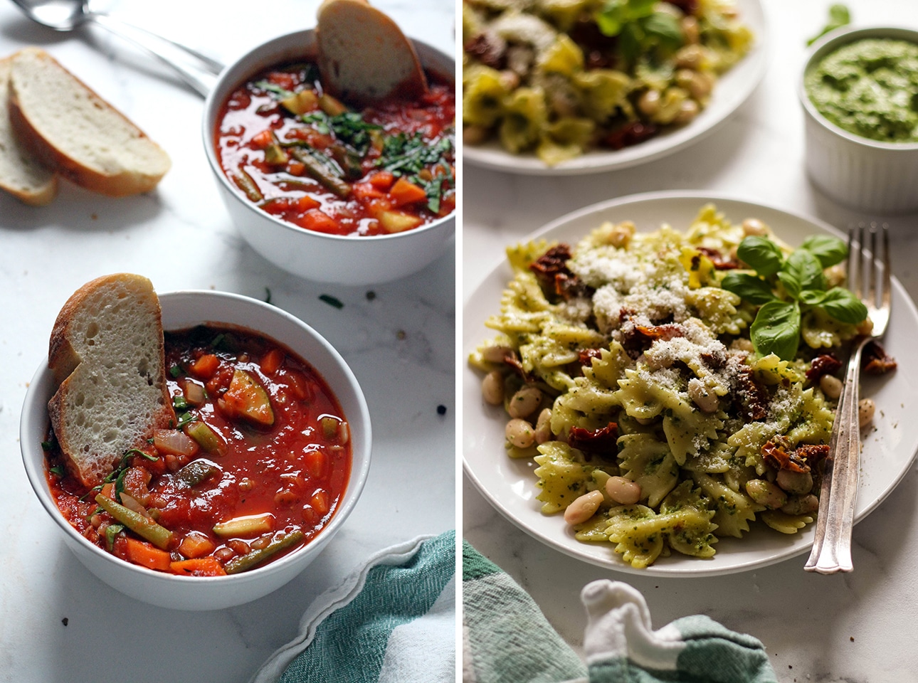
Monochromatic prop setup is another way to highlight the color of your food. By choosing neutral plates and backgrounds of the same color, you will cause the food to stand out more. It's a really easy way to make the food pop while adding subtle details that help tell a story.
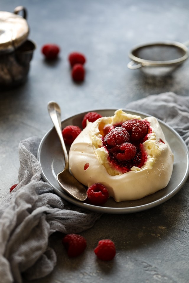
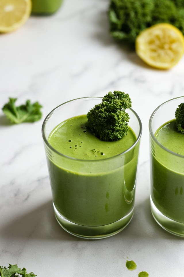
60-30-10 Rule
60-30-10 is a principle of color proportion used in art and design that implies that the main color takes 60% of your photo, the second color adds 30% and the third color is just in subtle details.
It doesn't have to be the exactly same color, you can use similar color tones and shades.
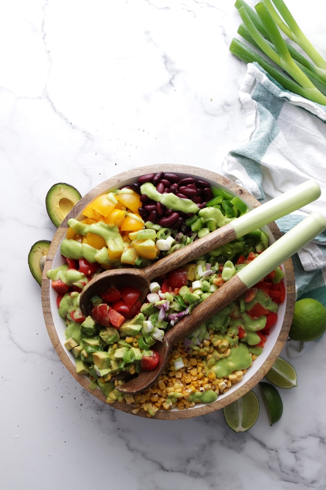
You can repeat the colors of your dish throughout the frame with your props. My favorite way to do it is to add ingredients as props to create cohesiveness in the frame.
Here is an example of that rule: the main color here is white, the secondary color is green and the supportive color is yellow. You can see how the colors create a cohesive look supporting the healthy vibe that I wanted to communicate with this picture by making it look bright, crisp and fresh.
Where Can I Learn More?
This is really only the tip of the iceberg when it comes to shooting food photography. I've spent years testing and tweaking methods, studying the best practices and techniques when it comes to capturing beautiful food.
I know that food photography can be confusing, but once you learn the basics of camera settings, composition and styling, food photography will become a breeze.
That's why I've created the Happy Kitchen Food Photography Course.
I've collected all the best food photography and food styling tips, tricks and hacks of the business, and share all of the secrets I've learned over the years with you, so you don't have to waste your time reading a million blog posts.
I'll personally guide you in how to create mouthwatering images that will keep readers coming back for more.
Leave a Reply